

Prettiness in books

You aren’t supposed to comment on the dust jackets you post in the #sevendaybookcoverchallenge, and you’re supposed to string it out for seven days, and it’s supposed to take place on social media, but whatever.
Even when the first printing of a first edition is pricey, the identical-looking second printing often isn’t. By leveraging one’s lack of the persnicketiness of a real collector, one can read in virtually as much luxe. I have a reputation in our household for reading even the nicest books I own on the subway or at the gym, so it’s just as well I’m a cheapskate. My memory is that I learned this life hack from a series on book-collecting that Jacob Weisberg wrote in 2005 on Slate, but re-skimming his articles now, I don’t see that advice. In any case, I didn’t spend more than fifty dollars for any book pictured here.
Now that there aren’t many brick-and-mortar bookstores left to browse in, it’s hard to find out about pretty books that one doesn’t yet know one wants. This is my service to the community.
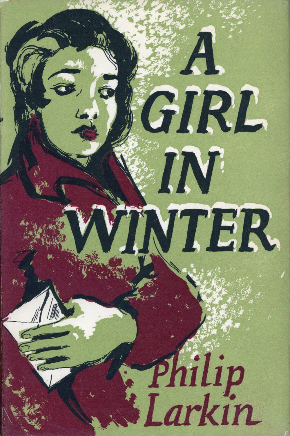
Designer: Margaret Wolpe. For Philip Larkin’s A Girl in Winter (Faber and Faber, 1947, 1956). “I want to reiterate that this is the second printing of the book, not the first,” wrote the bookseller who sold me this, before he sent it. I very much appreciated his honesty, but this was the version I was smitten with. In general this list is of my prettiest books not my favorite books but this one falls into both categories.
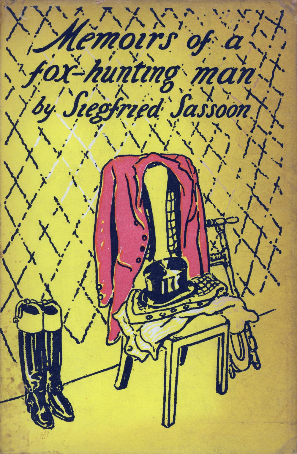
Designer: William Nicolson. For Siegfried Sassoon’s Memoirs of a Fox-hunting Man (Faber and Faber, 1928, 1954). Nicolson illustrated the heads and tails of chapters inside the book as well. More books for grown-ups should have illustrations.
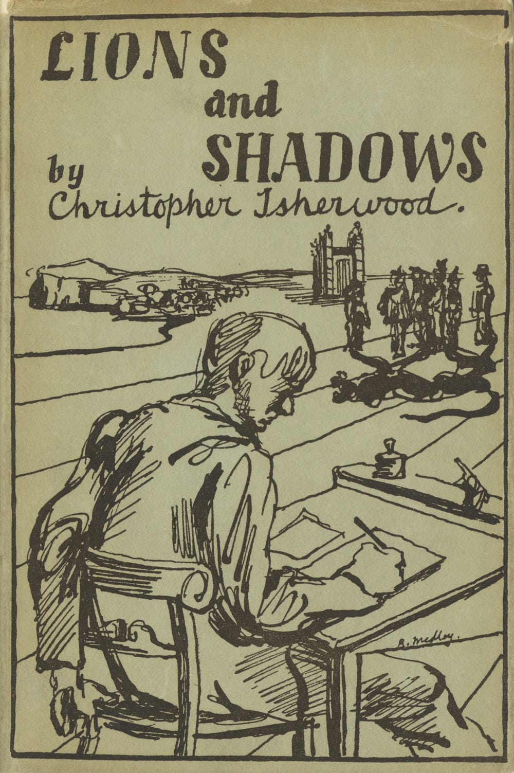
Designer: Robert Medley. For Christopher Isherwood’s Lions and Shadows (Hogarth Press, 1938). This one is in fact a first printing, and I got lucky. I only just now noticed that the collective shadows of the students standing on the right form the shape of a lion.
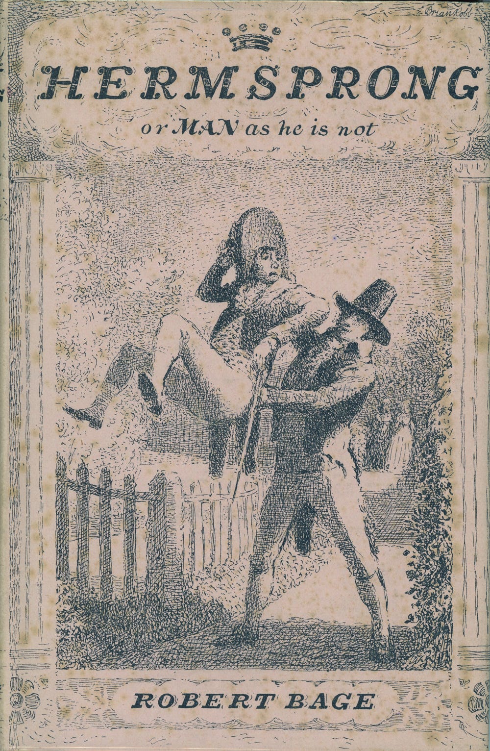
Designer: Brian Robb. For Robert Bage’s Hermsprong; or, Man as He Is Not (Turnstile Press, 1951). A twentieth-century edition of an 18th-century philosopher-wit’s novel, the kind of thing Diderot would have written if he were English. Not only should more books be illustrated, but more books should be salmon-pink with filigree etching–style cover art.
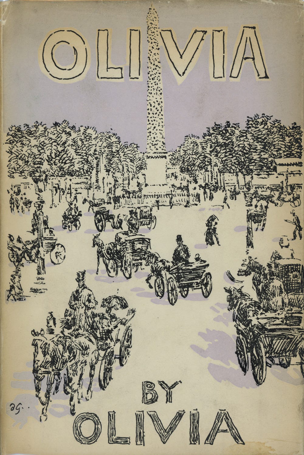
Designer: Duncan Grant. For Olivia’s Olivia (1949, second impression). An early lesbian novelette about being crushed out on one’s French schoolmistress. The book itself is also lavender.
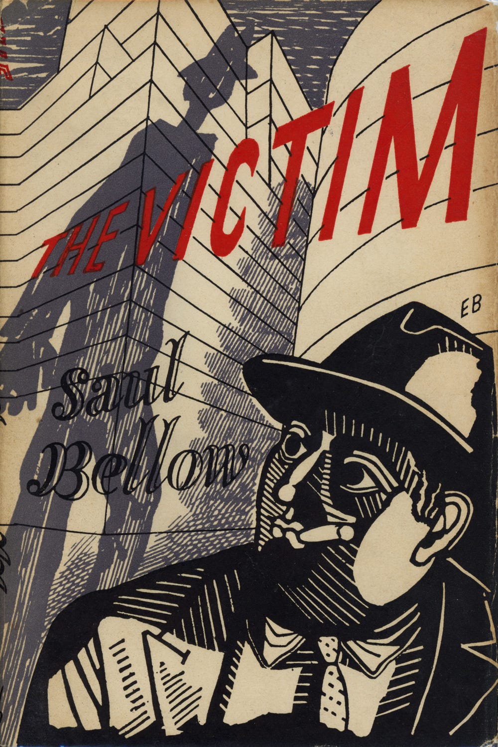
Designer: Edward Bawden. For Saul Bellow’s The Victim (John Lehmann, 1948). This is one of my favorite book covers. I have a theory that Mr. Sammler’s Planet can only properly be understood as a revision of/return to The Victim, but there is not room in the margin here to set out my whole proof.
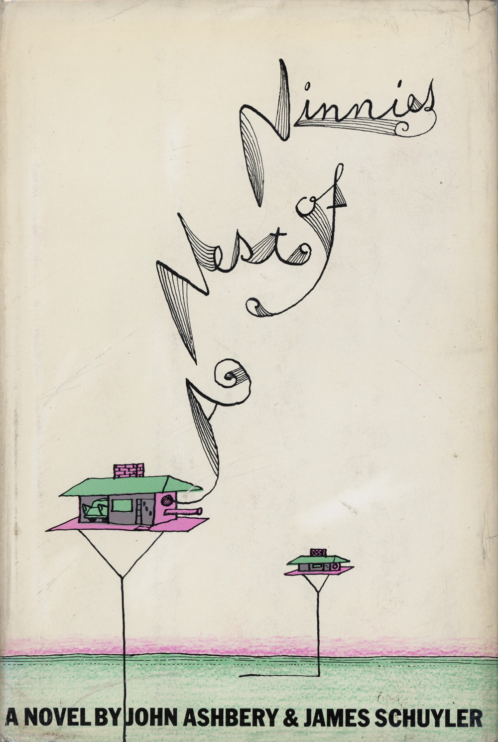
Designer: James McMullan. For John Ashbery and James Schuyler’s A Nest for Ninnies (E. P. Dutton, 1969). Schuyler’s Alfred and Guinevere is funnier, but this has a better cover.
My novel Overthrow will be published by Viking in August. Buy your copy now to be sure of a first printing!